Project
Mirai | Smart Field Demo
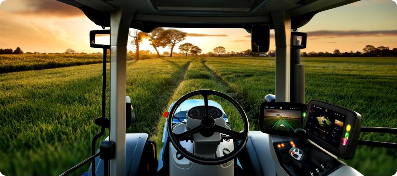
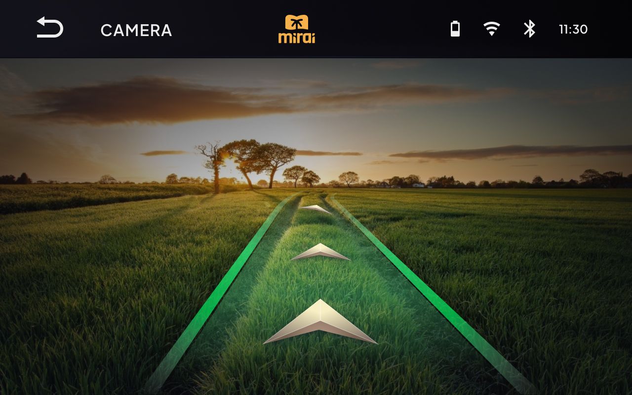
Smart Field Demo project aims to create an innovative interface model to be integrated into the machinery used to carry out agricultural activities, such as tractors. Smart farming in fact involves the introduction of precision agriculture systems within these vehicles useful for the management and optimization of field work, offering himself as a valid ally to the farmer in carrying out and managing his daily activities. These systems allow in fact to monitor data relative to the conditions of the ground, to the work in progress, to the presence of possible obstacles signaling them with appropriate alarms and warnings of presumed problems to the components of the vehicle.
Research and analysis phase
The research and analysis phase allowed to identify solutions already existing on the market in order to compare their functionalities and evaluate their individual opportunities and criticalities. In particular, 4 agricultural houses were analysed:
- John Deere
- Case IH
- Fendt
- New Holland All four provide one or more monitors of about 10 inches in size on which you can enjoy various functions presented to the user in a way often disorganized and not intuitive.
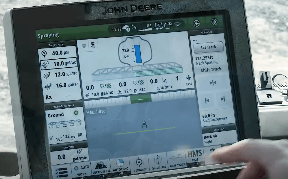
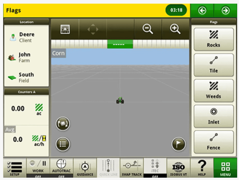
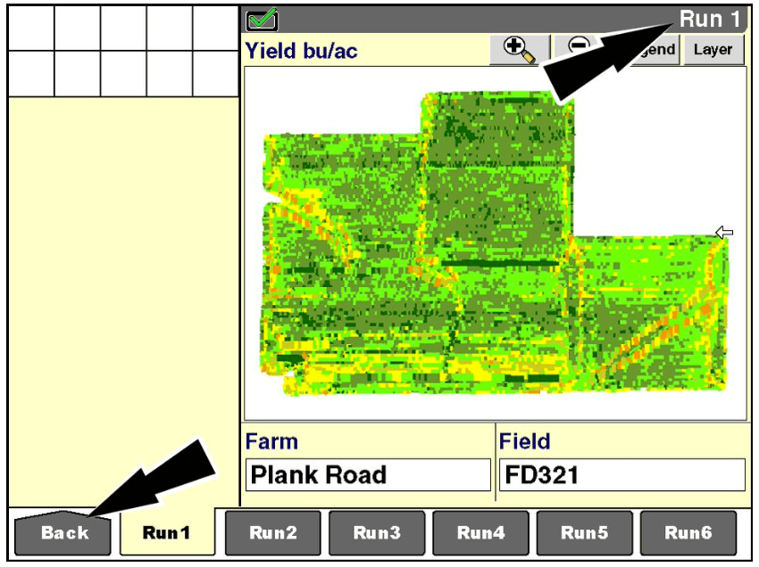
In particular, John Deere proposes a first extended monitor that allows to control simultaneously more functions with the vehicle stationary and a smaller one useful for independent control for automatic driving and to follow straight paths.
(images sources: John Deere)
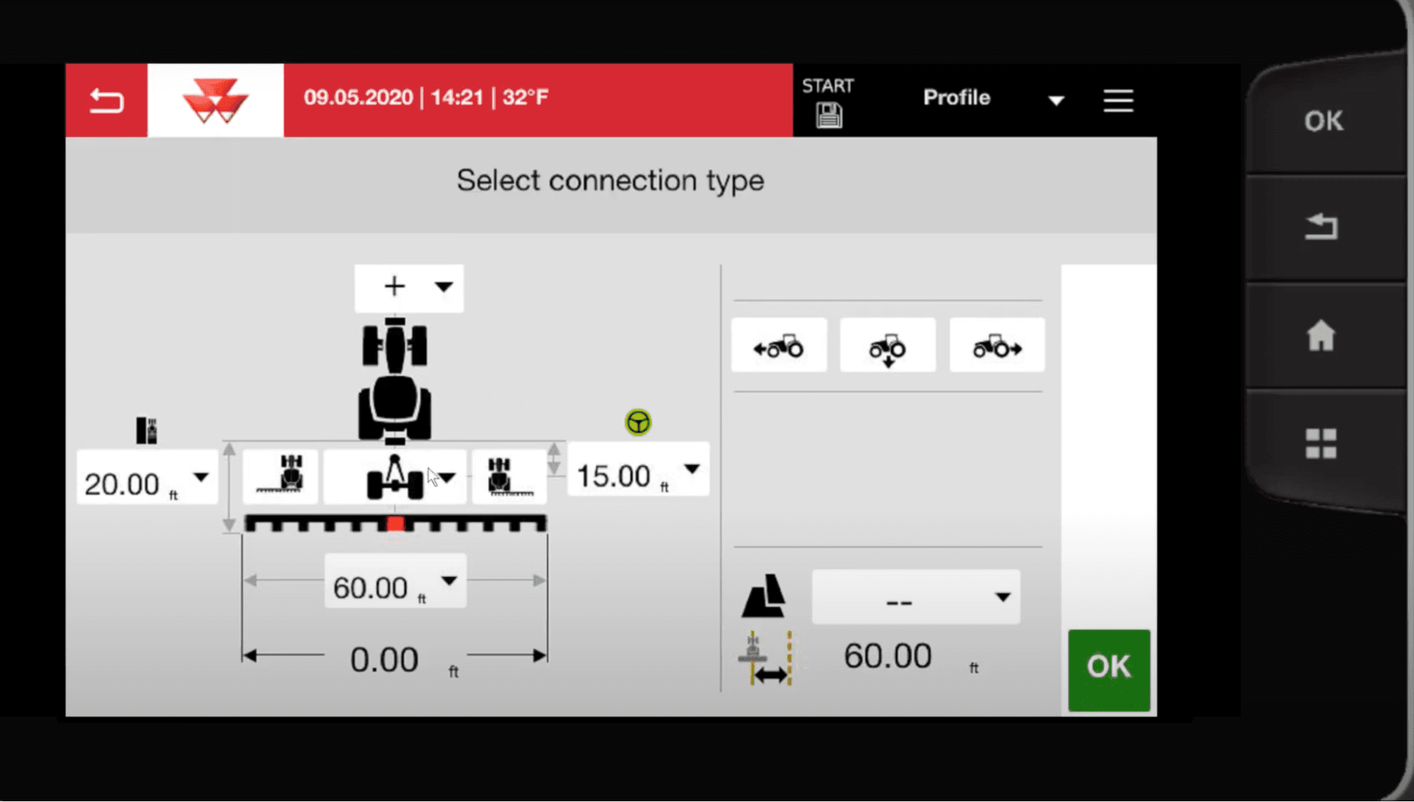
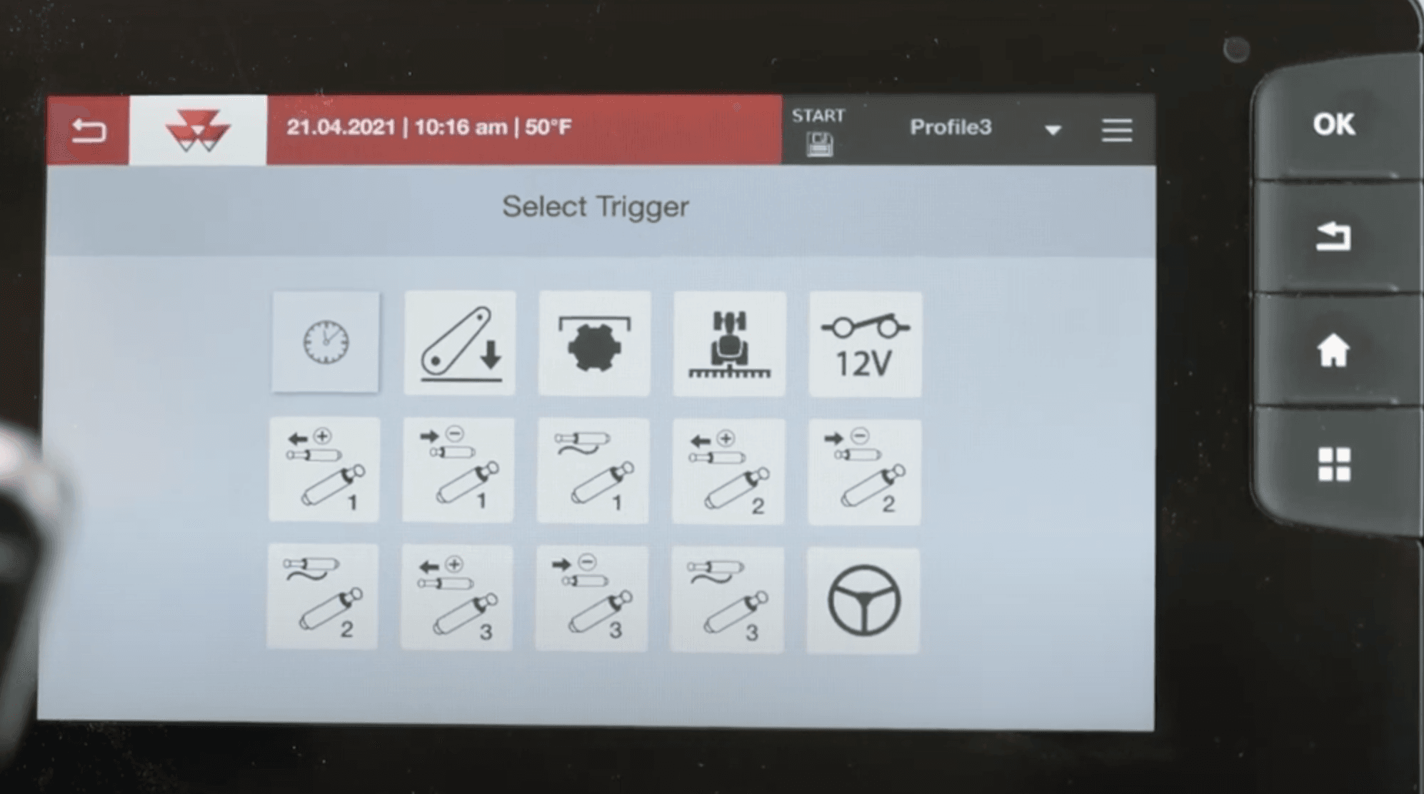
Case IH, on the other hand, offers a simpler and more intuitive interface that presents an overview of the available functions recognizable through simple icons but selectable by small buttons that make selection difficult, especially in an operational context such as that of field work.
(images source: Case IH)
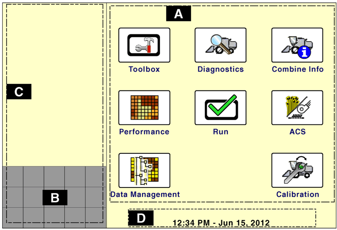
New Holland, offers a monitor divided into 4 sections related to the operating and machine settings (upper bar), the accessible operating screens (lower bar), key operating parameters (left side) and finally the display of the operating screen selected by the user with all the key parameters of the current activity (central area). Among the criticalities it presents are, however, the little visible back key and the touch keyboard useful for filling in the input fields that occupies the entire screen thus limiting the user’s view.
(images source: New Holland)
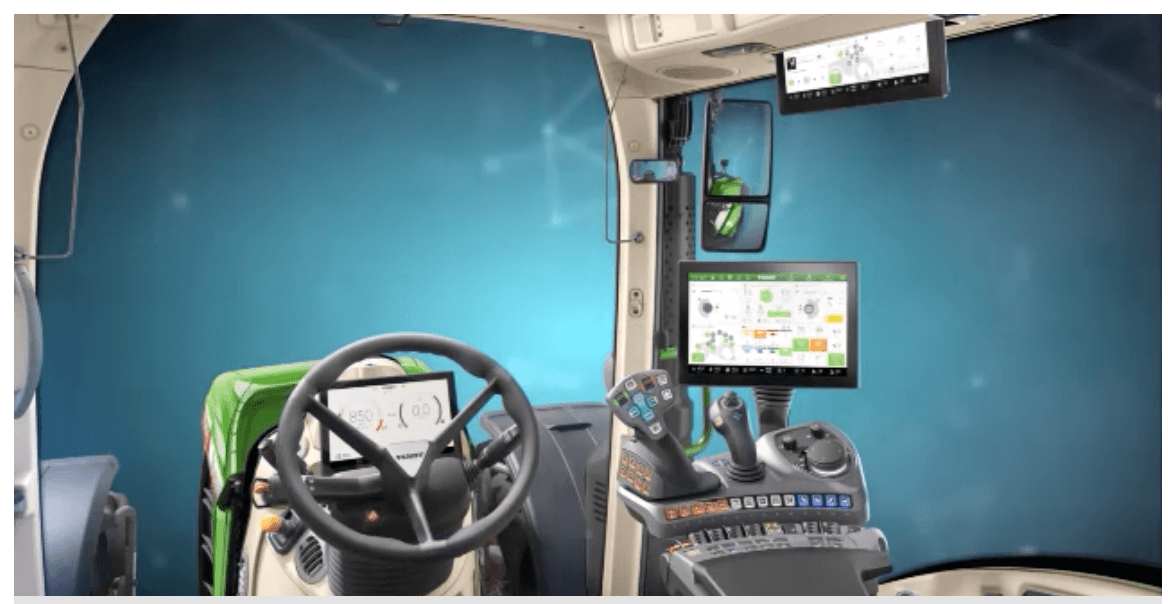
Finally, Fendt provides a solution with three monitors connected to each other: the screens can move between the various monitors, but with the risk that this distracts the operator from driving; In addition, there is a knob that allows you to replace touch navigation between monitors in case of dirt and noise, common limits to all the samples just analyzed: all these factors, along with others, can affect the responsiveness of the touchscreen screen thus causing possible system slowdowns.
(images source: Fendt)
Mirai's proposal
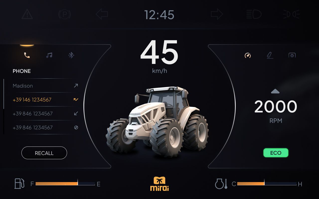
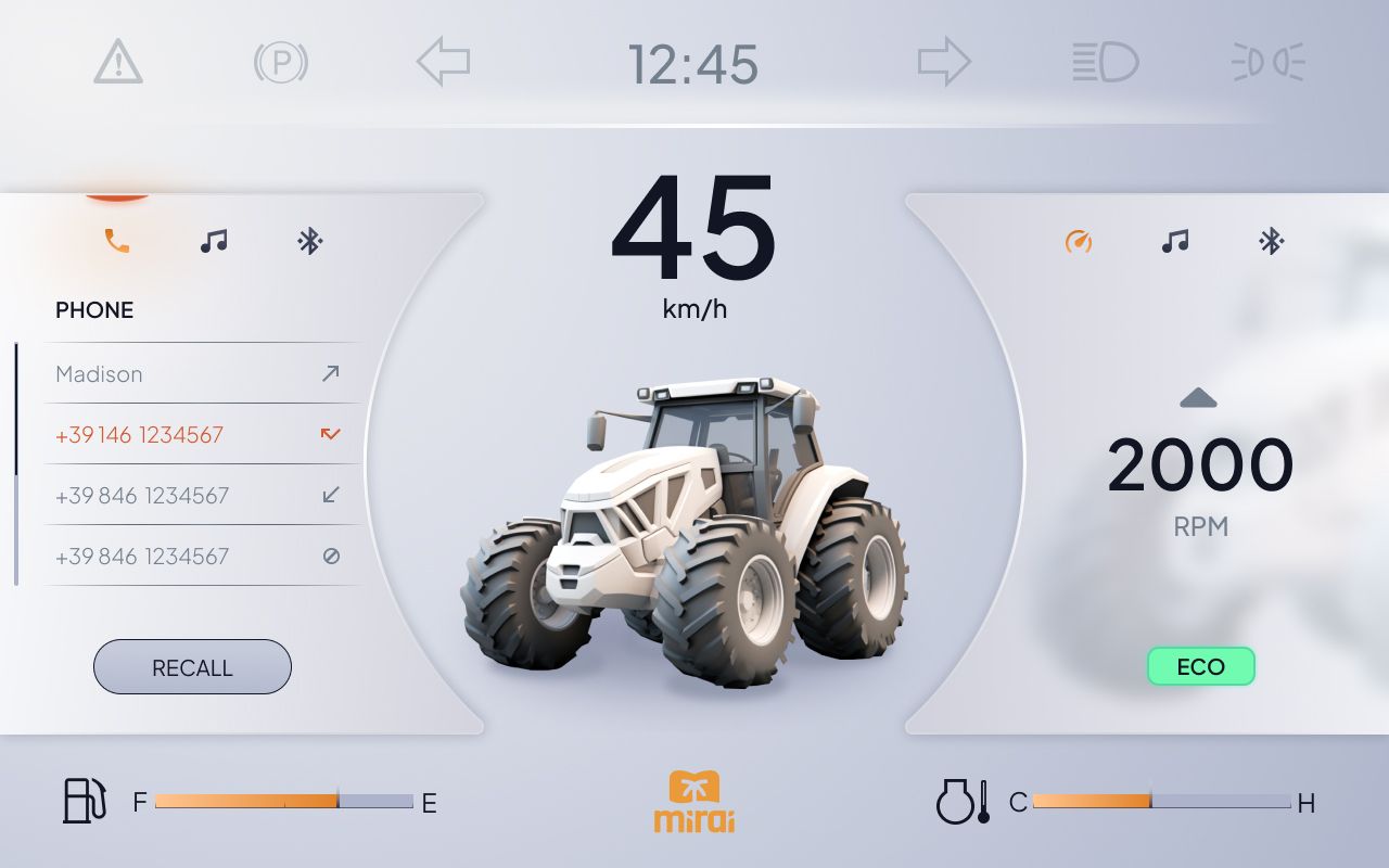
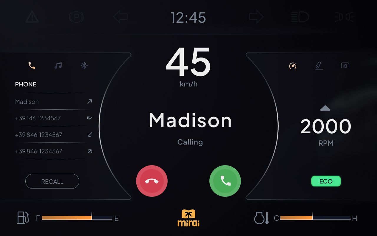
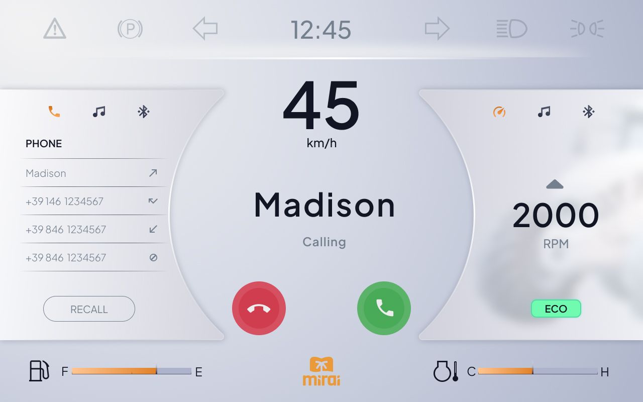
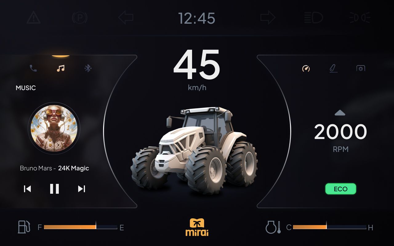
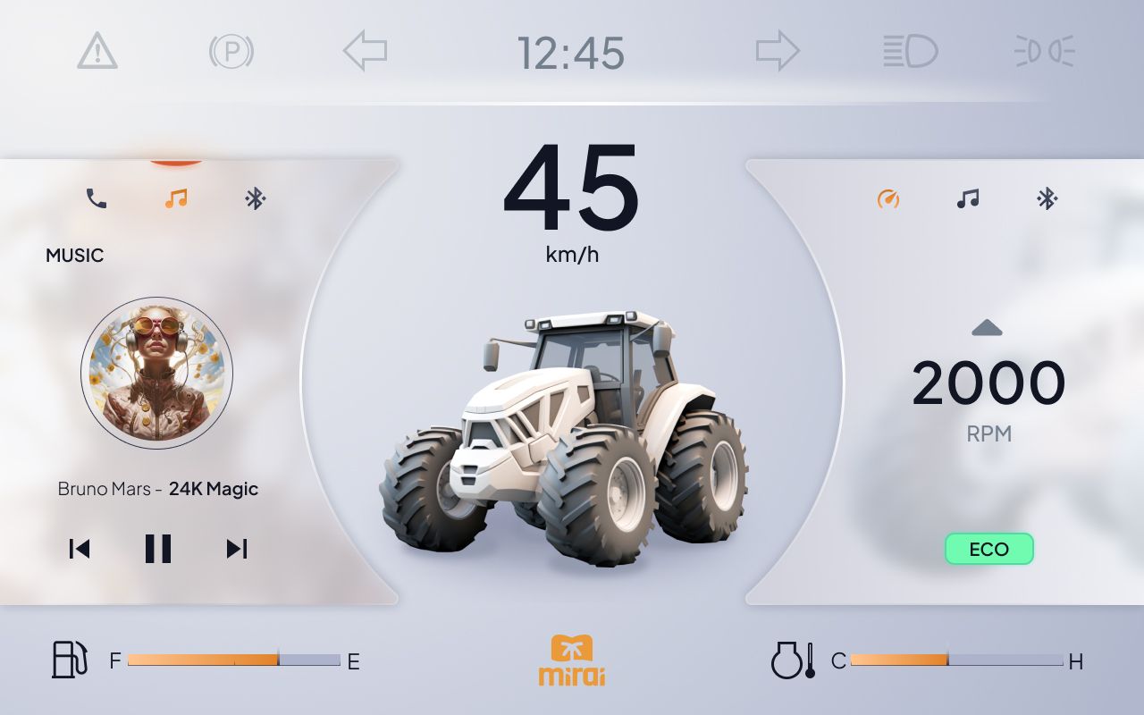
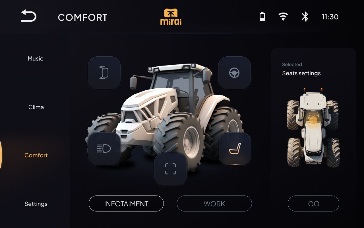
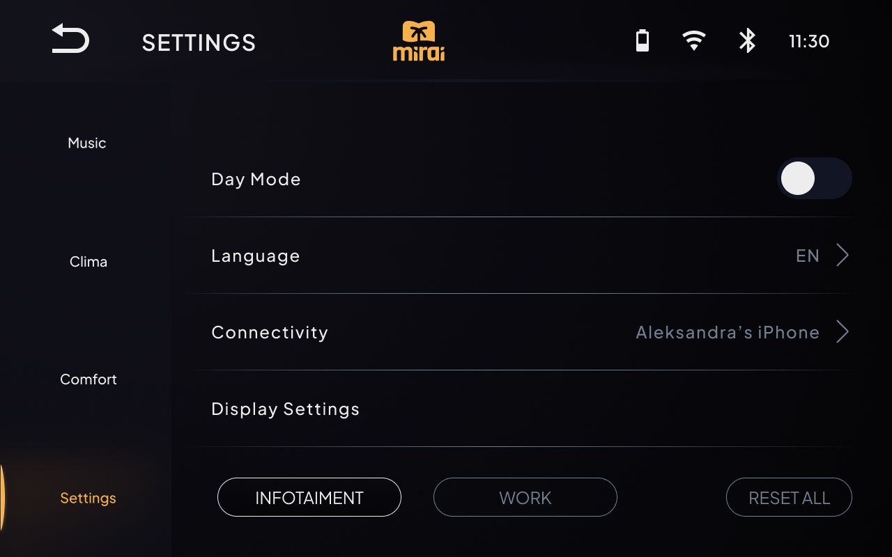
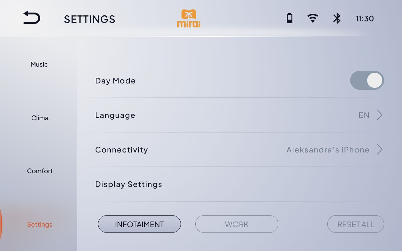
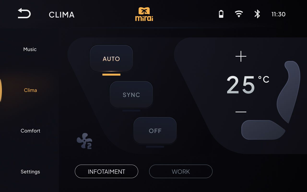
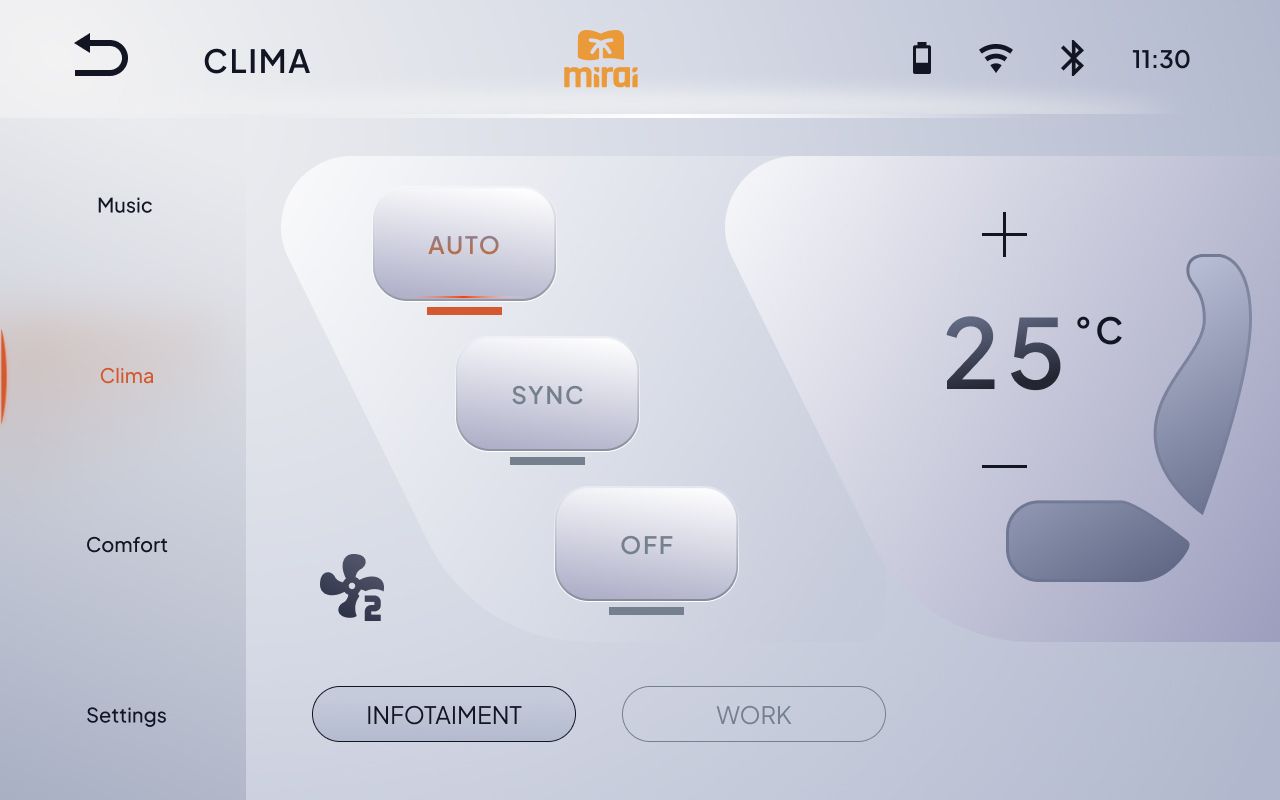
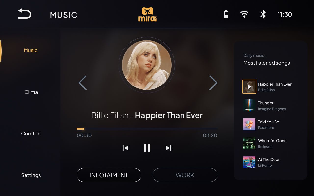
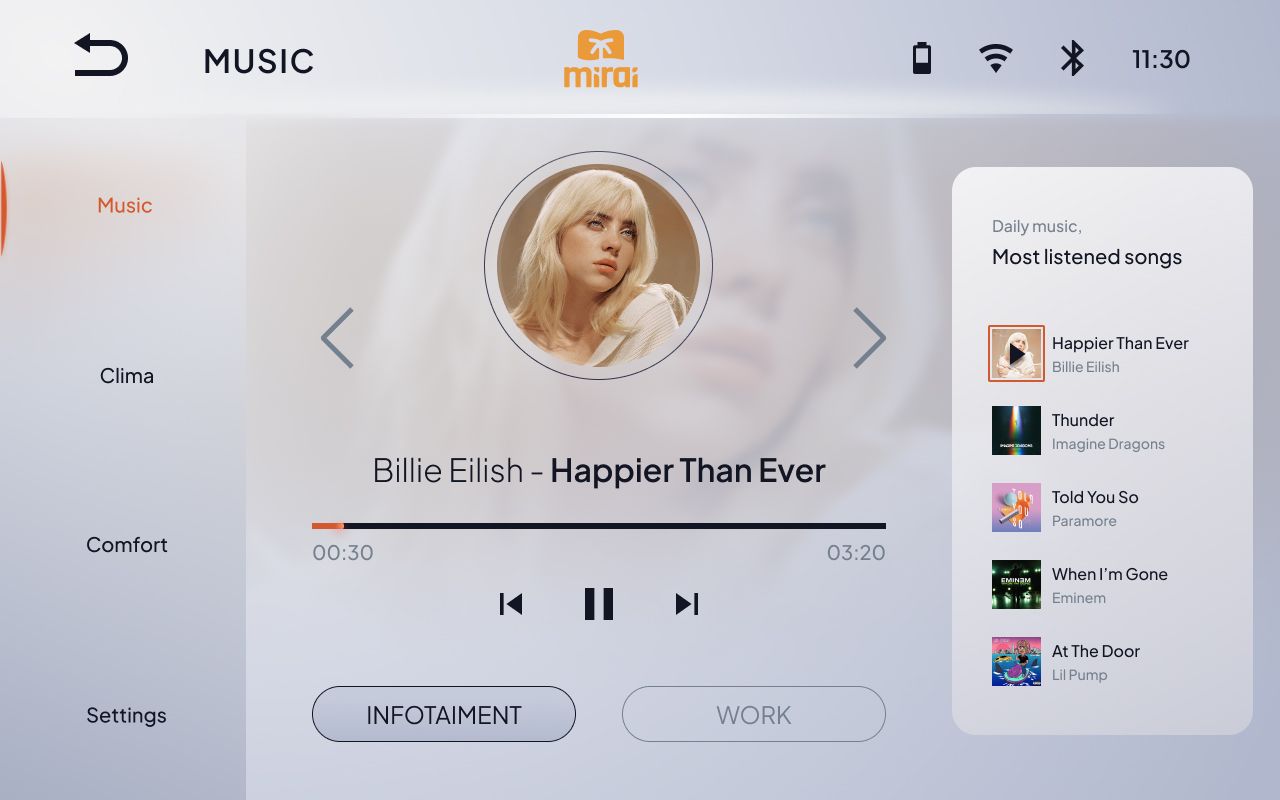
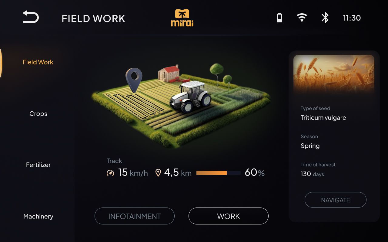
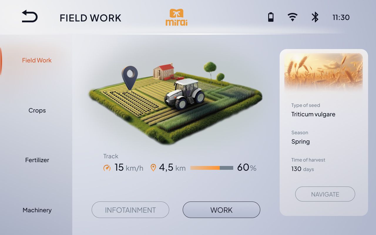
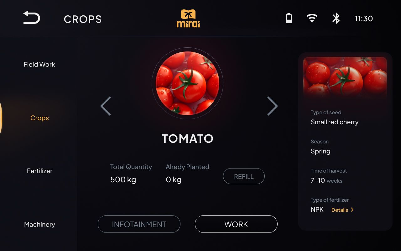
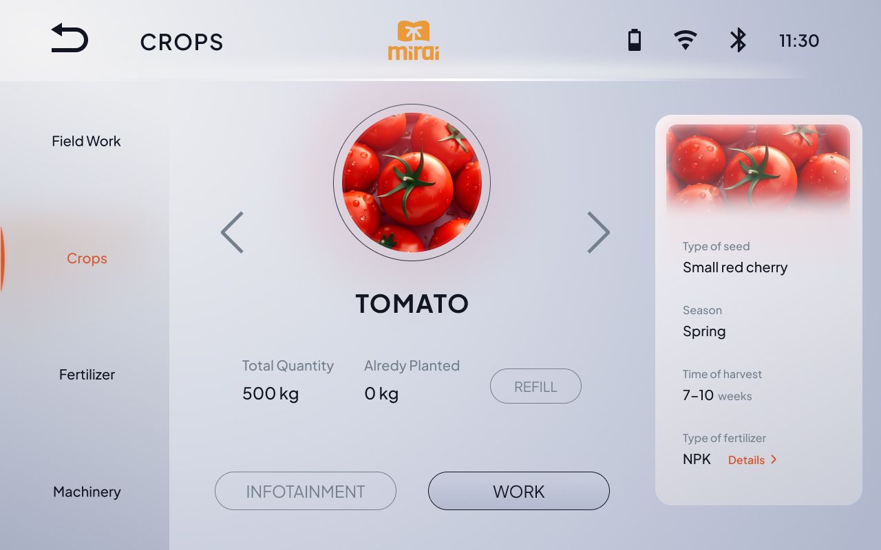
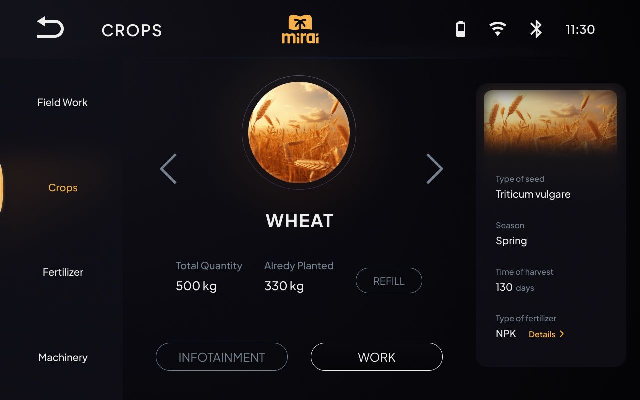
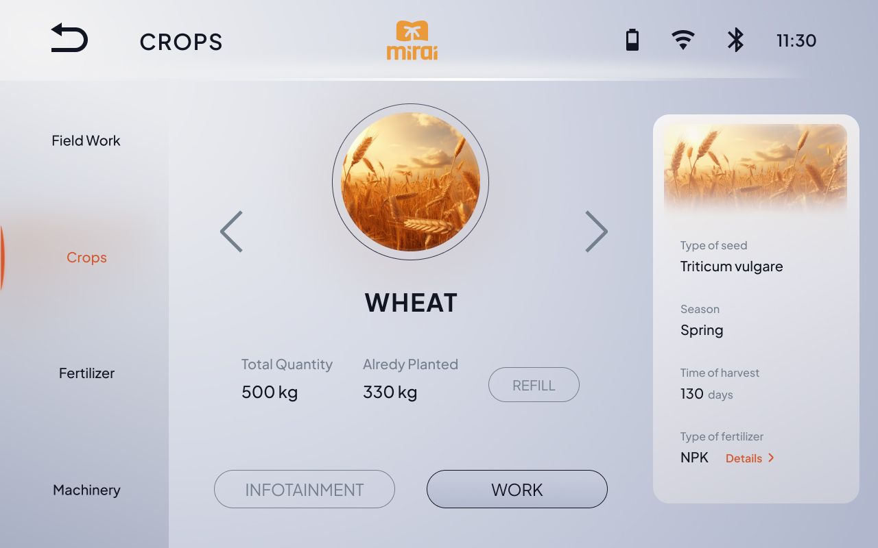
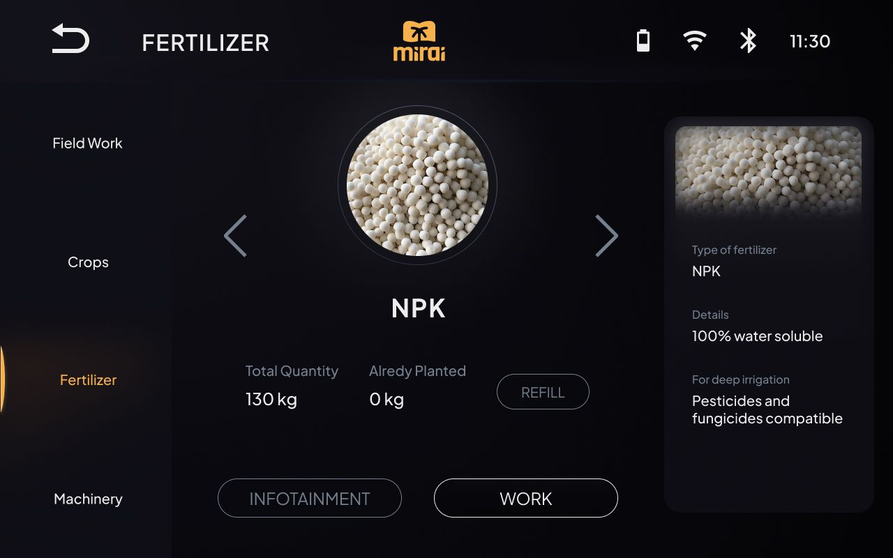
In order to maximize the performance of these systems, our interface proposal provides a set of features aimed at improving the latter. We want to offer the operator a double monitor on which to display in one the driving information based on the "classic" information of a cluster dedicated to the tractor (speed, fuel level, incoming calls) and in the other two separate sections, INFOTAINMENT and WORK;
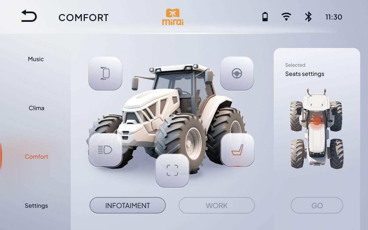
the first is a section from which you can manage vehicle settings related to climate, driving, sitting, lights, music and all general system settings;
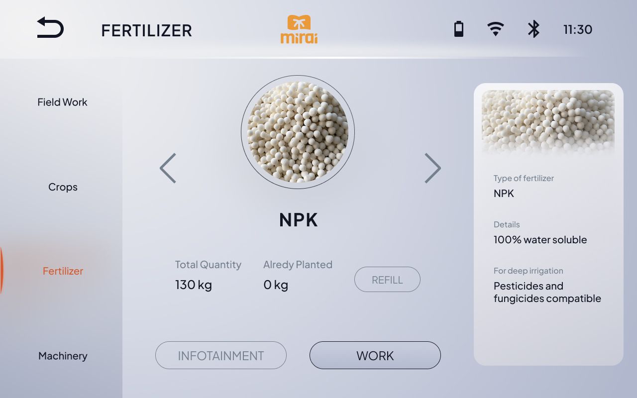
while the second is a section from which it is possible to manage the agricultural activity, monitoring all the information related to the progress of the activity in progress or to the specific cultivation or fertilizer that is being treated and using;
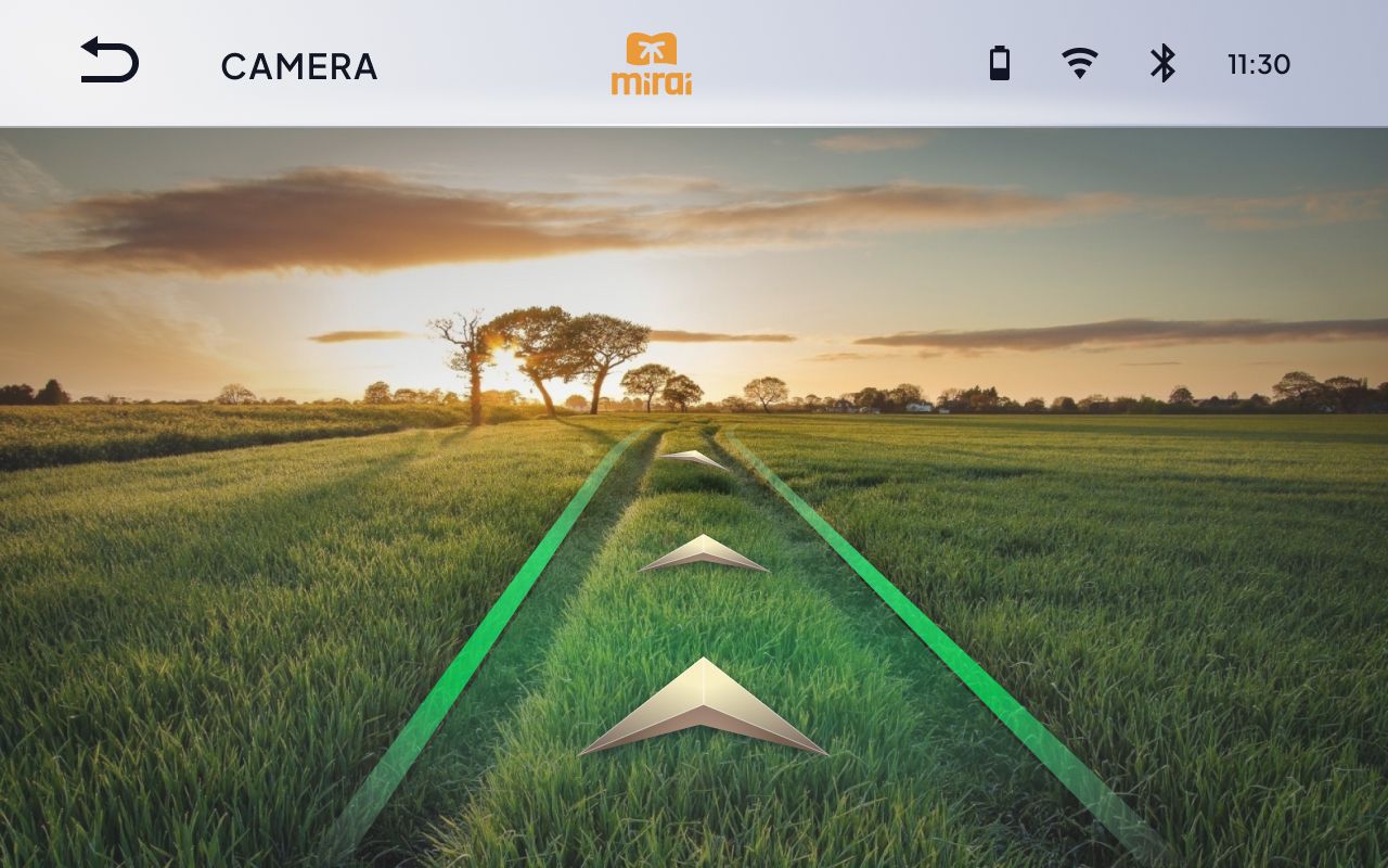
In addition, in order to minimize the interaction difficulties arising from problems such as fat fingers, that is, large fingers, and visual difficulties, Large elements have been developed at a distance from each other to create a simple and effective user experience. Finally, to optimize the readability in low light or excessive presence of sunlight, a dual mode of display of content on screen, a clear (day mode) and a dark (dark mode) has been prepared in order to simplify reading in any light condition.
